Accessibility is for people
Accessibility in web projects is not about others — it's about everyone
Andrea Junior Berselli
When we think about accessibility on the web, we often imagine something technical, reserved for developers or designers. But in reality it concerns anyone who publishes content online: from founders who set priorities, to designers, all the way to those who write a simple blog post.
An accessible web means a web that anyone can use, regardless of their abilities, the device they use, or the context they are in (slow connection, sunlight on the screen, noise, etc.). Improving accessibility not only helps people with disabilities, but makes the experience clearer, more predictable, and more pleasant for everyone.
Digital accessibility removes barriers that prevent millions of people from accessing online content, tools, and services. Think, for example, of:
A well‑designed site should, for example, allow keyboard navigation for those who cannot use a mouse. Or think of people with color blindness: if an important button is only red, without an icon or clear label, it may be hard to spot.
But the truth is that accessibility also helps those who do not have a permanent disability:
In short: it is not just about “helping someone”, but about creating a digital environment that works better for everyone.
A key aspect of accessibility is the concept of Universal Design, meaning the design of products and environments so that they can be used by as many people as possible, without the need for special adaptations.
When we develop an application or a website, we should think from the beginning about who will use it and ensure that the experience is smooth for everyone. This means taking care of:
An interface with well‑spaced buttons not only helps those with motor difficulties, but also improves usability for those browsing on mobile or in low‑visibility conditions. Likewise, clear and consistent labels in forms help everyone, not just people with cognitive difficulties.
<button class="btn-primary">
	<span aria-hidden="true">✅</span>
	<span>Confirm order</span>
</button>
.btn-primary {
background-color: #0053b3; /* dark blue */
color: #ffffff; /* white */
padding: 0.75rem 1.25rem;
border-radius: 0.375rem;
border: none;
font-size: 1rem;
cursor: pointer;
}
.btn-primary:hover {
background-color: #003f86; /* slightly darker blue */
}
.btn-primary:focus-visible {
outline: 3px solid #ffcc00; /* yellow */
outline-offset: 3px;
}aria-hidden="true"), the text is
what the screen reader actually reads.Web accessibility is based on four key principles, known as the POUR principles:
Content must be presented in ways that everyone can perceive, through at least one sensory channel (sight, hearing, touch).
Example: image with alternative text
<img
	src="/images/dashboard.png"
	alt="Line chart showing a constant increase in sales over the last 6 months"
/>
If the image is purely decorative:
<img src="/images/divider.svg" alt="" role="presentation" />The “perceivable” principle is not only about images: it applies to all the content on the site, including video, audio, and the way we use colors.
Videos must be accompanied by synchronized captions for those who cannot
hear the audio. For audio‑only content (podcasts, interviews), a
text transcript is essential. The <track> HTML element lets you
associate subtitle files in WebVTT format directly with the native player:
<video controls>
	<source src="/videos/tutorial.mp4" type="video/mp4" />
	<track
		kind="subtitles"
		src="/captions/tutorial.it.vtt"
		srclang="it"
		label="Italiano"
		default
	/>
	<track
		kind="subtitles"
		src="/captions/tutorial.en.vtt"
		srclang="en"
		label="English"
	/>
</video>A common mistake is using only color to communicate a state: for example, coloring an invalid field red without adding text or an icon. People with color blindness — about 4.5% of the global population — may not perceive the difference.
Only color
A screen reader does not read anything. A colorblind user does not distinguish the state.
Color + icon + text
A screen reader reads the state. It works for everyone.
<!-- ❌ Not accessible: only color distinguishes the states -->
<span class="dot dot-error"></span>

<!-- ✅ Accessible: color + icon + text + ARIA role -->
<span class="badge badge-error" role="status">
	<span aria-hidden="true">✗</span>
	<span>Error</span>
</span>
The same rule applies to charts: a pie chart that distinguishes slices only by color must also have text labels or a descriptive legend.
Everyone must be able to navigate the site, even without a mouse. This means interactive components must be reachable and activatable via keyboard, with a visible focus state.
Example: accessible main navigation
<nav aria-label="Main navigation">
	<ul>
		<li><a href="/about">About us</a></li>
		<li><a href="/services">Services</a></li>
		<li><a href="/blog">Blog</a></li>
		<li><a href="/contact">Contact</a></li>
	</ul>
</nav>
By using real <a> links with href, the navigation is automatically
keyboard‑accessible (Tab) and can be activated with Enter/Space.
One of the most common mistakes is removing the focus outline — often for aesthetic reasons — without replacing it with a visible alternative. For keyboard users, it is essential to know where focus is at any given time.
/* ❌ Never do this: it makes the focus state invisible */
:focus {
	outline: none;
}

/* ✅ Replace it with something clearly visible */
:focus-visible {
	outline: 3px solid #ffcc00;
	outline-offset: 3px;
}
The :focus-visible pseudo‑class is preferable to :focus because it is
triggered only when focus is reached via keyboard or similar navigation — not
by mouse click — thus avoiding the outline in contexts where it is not needed.
Some users, especially those with photosensitive epilepsy or vestibular disorders, may find animations disturbing or even dangerous. Operating systems allow them to enable a preference called “Reduce Motion”, which browsers expose via a CSS media query.
Loading...
Try it yourself: activate "Reduce motion" in the accessibility settings of your operating system (macOS: Accessibility → Screen; Windows: Ease of Access → Display) and reload the page. The animation will automatically stop.
.spinner {
	animation: spin 0.8s linear infinite;
}

/* Disable the animation if the user has requested it */
@media (prefers-reduced-motion: reduce) {
	.spinner {
		animation: none;
	}
}
An even safer strategy is to disable animations by default and enable them only when the preference is not set:
/* Animation disabled by default */
.spinner {
	/* no animation */
}

/* Only activated if the user has no reduced‑motion preference */
@media (prefers-reduced-motion: no-preference) {
	.spinner {
		animation: spin 0.8s linear infinite;
	}
}
This media query applies to everything: transitions, parallax effects, automatic sliders, and any other motion.
If your site has automatic carousels, temporary popups, or session timeouts, users must be able to pause, stop, or extend these mechanisms. A carousel that advances every three seconds without a pause button is a real barrier for screen reader users or people with cognitive difficulties — content disappears before they can process it.
Content must be clear and predictable. Interfaces that change unexpectedly, cryptic error messages, or buttons with ambiguous labels make the experience difficult for everyone, not just for people with cognitive disabilities.
Example: form with clear labels and instructions
<form aria-describedby="signup-help">
	<p id="signup-help">Fields marked with * are required.</p>

	<label for="email">Email *</label>
	<input id="email" name="email" type="email" required />

	<label for="password">Password *</label>
	<input id="password" name="password" type="password" required minlength="8" />

	<button type="submit">Create account</button>
</form>Declaring the document language with the lang attribute on the <html>
element is essential: screen readers use it to select the correct synthetic
voice, with proper pronunciation and intonation. Without it, a synthesizer
might read text using the wrong phonetic rules.
<!-- Page in Italian -->
<html lang="it"></html>
If a word or phrase is in a different language from the rest of the document, it should also be indicated locally:
<p>
	We adopt the
	<span lang="en">test-driven development</span>
	in all our projects.
</p>
Without lang="en" on the <span>, a screen reader set to Italian
could pronounce “test-driven development” using Italian phonetic rules,
making it hard to understand.
A predictable interface reduces cognitive load. Concretely, this means:
A classic counter‑example is a <select> with an onchange handler that
automatically navigates to the selected page — without a separate “Go”
button. Keyboard users may find themselves thrown onto a new page before
they have finished choosing.
The site must be compatible with different assistive technologies, such as screen readers and voice commands, and work across various devices and browsers. This requires:
<button>, <nav>, <main>, <header>,
etc.);<h1> → <h2> → <h3>…);The first rule of ARIA (Accessible Rich Internet Applications) is: do not
use it when semantic HTML is already enough. A native element is always
more robust than a <div> with ARIA roles added, because the browser and
assistive technologies support it natively — including keyboard handling,
focus, and announcements.
<!-- ❌ div with ARIA: fragile, requires manual keyboard and focus handling -->
<div role="button" tabindex="0" onclick="..." onkeydown="...">Submit</div>

<!-- ✅ native button: accessible by default, no extra code needed -->
<button type="submit">Submit</button>
ARIA instead becomes essential for building complex widgets that do not have a native HTML equivalent, such as tab panels, dialogs, comboboxes, and tree navigation:
<div role="tablist" aria-label="Profile sections">
	<button
		role="tab"
		aria-selected="true"
		aria-controls="panel-info"
		id="tab-info"
	>
		Information
	</button>
	<button
		role="tab"
		aria-selected="false"
		aria-controls="panel-security"
		id="tab-security"
	>
		Security
	</button>
</div>

<div role="tabpanel" id="panel-info" aria-labelledby="tab-info">
	<!-- Panel content -->
</div>
Here, role="tab" with aria-selected and aria-controls is necessary
because HTML does not offer a native tab element. In these cases ARIA is
the right tool.
Screen readers allow users to navigate headings as if they were a table of contents — it is one of the most common ways to move around a page. An incorrect hierarchy makes this navigation confusing.
Each page should have only one <h1>, and subsequent levels should
follow an increasing order without skipping levels:
<!-- ❌ Incorrect hierarchy: jumps from h2 to h4 -->
<h1>Products</h1>
<h2>Software</h2>
<h4>Cloud</h4>

<!-- ✅ Correct hierarchy -->
<h1>Products</h1>
<h2>Software</h2>
<h3>Cloud</h3>
Headings should not be chosen based on visual size, but on their semantic
level in the content hierarchy. If you need large text that is not a heading,
use a <p> with appropriate CSS styling.
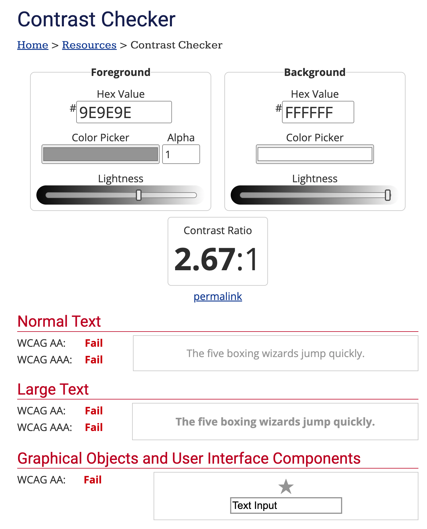
A common problem is light gray text on a white background, which is hard to read for many people.
Not accessible example:
This is a text with a wrong contrast.text-muted {
color: #9e9e9e; /* light gray */
background-color: #ffffff; /* white */
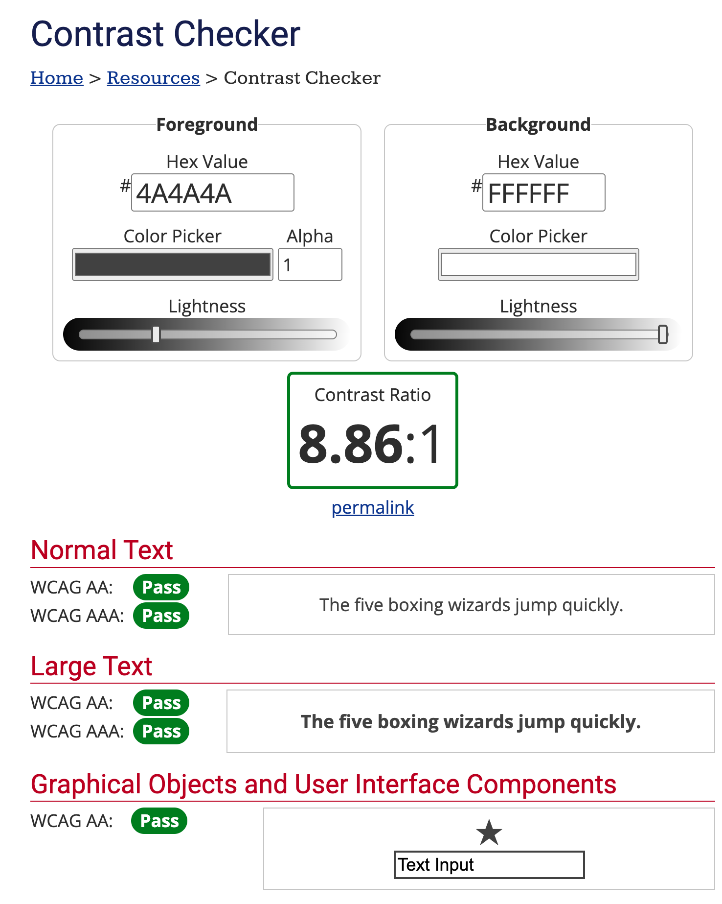
}Improved version:
This is a text with a good contrast.text-muted {
color: #4a4a4a; /* darker gray */
background-color: #ffffff;
}To check contrast you can use tools like WebAIM Contrast Checker or Accessible Brand Colors. WCAG recommends a ratio of at least 4.5:1 for normal text and 3:1 for large text.
Here is an example from the WebAIM site to check the contrast of the two previous examples:
The example that fails the contrast ratio.
The example that passes the contrast ratio.
Without alternative text, screen reader users have no way to understand what an image represents.
Incorrect example:
<img src="/avatars/user123.png" />Correct version:
<img src="/avatars/user123.png" alt="Laura Rossi's avatar" />If the image is purely decorative:
<img src="/decorations/line.svg" alt="" role="presentation" />An unclear structure makes it hard to understand where you are and how to reach the main sections. A very useful pattern is the skip link, which allows users to jump directly to the main content.
<a class="skip-link" href="#main-content">Skip to main content</a>

<header>...</header>

<main id="main-content">
	<!-- Main content -->
</main>
.skip-link {
position: absolute;
left: -9999px;
top: 0;
background: #000;
color: #fff;
padding: 0.5rem 1rem;
z-index: 100;
}
.skip-link:focus {
left: 0.5rem;
top: 0.5rem;
}Buttons and links should be big enough to be easily activated, even by those with motor disabilities or using a finger on a touch screen. The minimum recommended size is approximately 44x44 pixels.
Example: extended clickable target
<a href="/profile" class="profile-link">
	<span class="label">Profile</span>
</a>
.profile-link {
background-color: #0053b3;
color: #ffffff;
display: inline-flex;
align-items: center;
gap: 0.5rem;
padding: 0.5rem 0.75rem; /* increase clickable area */
}In this way the clickable area is not only the text, but the whole block.
As mentioned earlier, forms are often one of the most critical parts of a website. Ambiguous errors, generic messages, or positioned far from the field make it difficult to understand what to do.
An accessible form should:
input to its label;<form id="a11y-form" aria-describedby="form-help form-errors" novalidate>
<p id="form-help">All fields are required unless otherwise indicated.</p>
<div
id="form-errors"
class="visually-hidden"
aria-live="polite"
tabindex="-1"
></div>
<div
id="form-success"
class="visually-hidden"
aria-live="polite"
tabindex="-1"
></div>
<div class="field">
<label for="email">Email</label>
<input id="email" name="email" type="email" required aria-invalid="false" />
</div>
<div class="field">
<label for="age">Age</label>
<input
id="age"
name="age"
type="number"
min="18"
required
aria-invalid="false"
/>
</div>
<button type="submit">Submit</button>
</form>.visually-hidden {
position: absolute;
width: 1px;
height: 1px;
padding: 0;
margin: -1px;
overflow: hidden;
clip: rect(0, 0, 0, 0);
white-space: nowrap;
border: 0;
}
.form-container input.field-error-input {
border-color: #b00020; /* dark red with good contrast */
outline-color: #b00020; /* dark red with good contrast */
}
#form-errors {
color: #b00020; /* dark red with good contrast */
font-size: 0.875rem;
margin-top: 0.25rem;
margin-bottom: 0.5rem;
display: flex;
flex-direction: column;
gap: 0.25rem;
}
#form-success {
color: #008600; /* green with good contrast */
font-size: 0.875rem;
margin-top: 0.25rem;
}Simple error handling in JavaScript:
const form = document.querySelector('#a11y-form')

if (form instanceof HTMLFormElement) {
	form.addEventListener('submit', handleA11yFormSubmit)
}

function addFieldError(input, message) {
	if (!(input instanceof HTMLInputElement)) return
	input.setAttribute(
		'aria-invalid',
		'true',
	) /* signals to the screen reader that the field is in error */
	input.classList.add('field-error-input')
	const errorSpan = document.createElement('span')
	errorSpan.className = 'field-error'
	errorSpan.textContent = message
	if (input.parentElement) {
		input.parentElement.appendChild(errorSpan)
	}
}

function handleA11yFormSubmit(event) {
	event.preventDefault()

	if (!(form instanceof HTMLFormElement)) return false

	const errorsContainer = form.querySelector('#form-errors')
	const successContainer = form.querySelector('#form-success')
	if (!(errorsContainer instanceof HTMLElement)) return false

	errorsContainer.innerHTML = ''
	successContainer.innerHTML = ''
	const email = form.querySelector('#email')
	const age = form.querySelector('#age')

	let hasError = false
	const messages = []

	;[email, age].forEach((input) => {
		if (!(input instanceof HTMLInputElement)) return
		input.setAttribute('aria-invalid', 'false')
		input.classList.remove('field-error-input')
		const errorSpan = input.parentElement
			? input.parentElement.querySelector('.field-error')
			: null
		if (errorSpan) errorSpan.remove()
	})

	if (
		!(email instanceof HTMLInputElement) ||
		!email.value ||
		!email.validity.valid
	) {
		hasError = true
		messages.push('<span>- Insert a valid email address.</span>')
		addFieldError(email, 'Insert a valid email address.')
	}

	if (
		!(age instanceof HTMLInputElement) ||
		!age.value ||
		Number(age.value) < 18
	) {
		hasError = true
		messages.push('<span>- You must be at least 18 years old.</span>')
		addFieldError(age, 'You must be at least 18 years old.')
	}

	if (hasError) {
		errorsContainer.classList.remove('visually-hidden')
		errorsContainer.innerHTML = `
      <b>Some errors have been detected:</b>
      ${messages.join('')}
    `
		errorsContainer.focus()
	} else {
		// Demo: no real submit, only accessible success message
		successContainer.classList.remove('visually-hidden')
		successContainer.innerHTML = `
      <span>Form submitted successfully (demo): in this example the data is not actually sent.</span>
    `
		successContainer.focus()
	}

	return false
}
Key points:
aria-invalid="true" signals to the screen reader that the field is in error;aria-live="polite") informs
immediately those who cannot see the visual layout;You do not need a revolution to improve accessibility. Where to start depends on your situation: are you working on an existing site, or do you have the chance to build something from scratch?
When accessibility was not considered from the beginning, the most effective way to improve it is to work by priority — fixing the most serious and most frequent barriers first, without trying to solve everything at once.
1. Run an automatic audit
Tools like Lighthouse
(built into Chrome DevTools), WAVE (also available
as a Chrome extension),
or axe DevTools can identify the most
obvious issues in a few seconds: insufficient contrast, input elements without
label, images without alt, buttons without accessible text.
One important warning: no automated tool can catch all problems. Automation is estimated to cover about 30–40% of real issues. Manual testing is indispensable.
2. Test keyboard navigation
This test takes five minutes and often reveals serious barriers that no automated tool will find:
Tab to move through interactive elements, Shift+Tab to go
backwards;3. Check contrast, alt text, and forms
alt="" only for purely decorative images.input must have an associated label, and errors
must be descriptive and linked to the field via aria-describedby.prefers-reduced-motion media query.4. Test with a screen reader
Screen reader testing is the most direct way to understand what someone who cannot see the page experiences. You do not need to be an expert:
Cmd + F5 on Mac, or via Settings → Accessibility on iPhone.Try navigating the page using only the screen reader, without looking at the screen. If you can understand the structure, find the main content, and complete key actions (fill out a form, activate a button), you are on the right track.
5. Fix issues by priority
Not everything can be solved in a single sprint. Use this order of priority as a guide:
To help you, you can use the WCAG 2.1 Quick Reference as a detailed checklist.
When you are building something new, accessibility is much cheaper. It is far easier to design things well from the beginning than to fix them later. Every compromise you make today in design or development becomes technical debt you will have to pay back in the future.
💅 Start from design
Even before writing code, some design decisions directly impact accessibility:
rem, never in fixed px (users who have
set a larger font size in the browser will see it respected);🧠 Think in components, not individual pages
An accessible component system — buttons, inputs, modals, menus — ensures
that every new page built with those components inherits accessibility
with no extra effort. Building a good <Button> once means you never
have to fix it again.
🤖 Automate wherever you can
<img>
without alt or <button> without text.💡 There is one principle that applies both if you are improving an existing site and if you are starting from scratch: using semantic HTML is always the most robust choice.
Browsers have already had decades of work put into making native elements
accessible: a <button> is automatically keyboard‑accessible, can be
activated with Enter and Space, is announced correctly by screen readers,
and responds to focus without a single line of JavaScript. A <div> with
role="button" requires you to manually re‑implement all of this — and
something is often forgotten.
<!-- This works with keyboard, screen reader, touch, everything -->
<button type="submit">Submit request</button>

<!-- This requires tabindex, onkeydown, role, aria-label... and often something is missing -->
<div class="btn" onclick="submit()">Submit request</div>
The same is true for page structure: <nav>, <main>, <header>,
<footer>, <article>, <aside> are not just stylistic conventions. They
are landmarks that screen readers use to build a map of the page,
allowing users to jump straight to the section they are looking for.
A site built on correct semantic HTML — without <div> instead of
<button>, without headings chosen for visual size instead of level,
without tables used for layout — is accessible almost by definition and
requires very little additional ARIA.
🚧 This is not a constraint: it is the shortest path to an inclusive site.
One often overlooked aspect is the need to publicly declare the accessibility level of your site. This is done through an accessibility statement, which informs users about what has been done to make the site accessible and about any remaining limitations.
A good accessibility statement should include:
A brief example might be:
We are committed to making this site as accessible as possible, in accordance with the WCAG 2.1 level AA standards. If you encounter barriers or difficulties using the site, you can contact us at
accessibility@yourdomain.com. Every report will be reviewed and, where possible, we will use your feedback to further improve the site.
Making this information easy to find (for example in the site footer) shows commitment and transparency towards users.
📌 To help you write your accessibility statement (in Italy), you can read directly what the AGID says.
Making the web accessible is a collective responsibility that benefits everyone. It is not a goal to reach once and for all, but a continuous process of listening, designing, and improving.
Even small changes — one more alternative text, a corrected contrast, a form that explains errors more clearly — can make a big difference in someone’s experience.
🚀 Let’s start today, project by project, building a truly inclusive internet.